Why Is Glass Color Overlooked in Luxury Home Design?
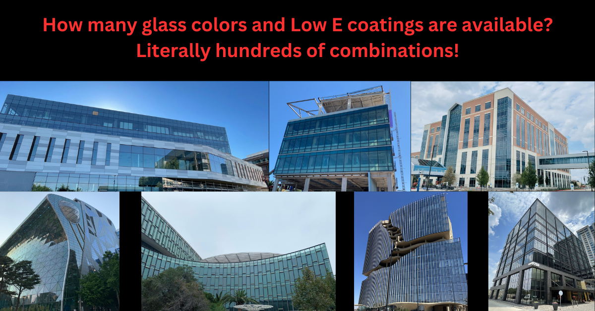
When designing a luxury custom home, why is glass color and coating so often overlooked? Why is your window company presenting default options—clear or gray Low-E, white or bronze or black frames—rather than engaging in a thoughtful design conversation? Commercial architects routinely evaluate dozens of combinations. Why not in residential?
I spent 20 years working alongside designers and homeowners carefully selecting every finish, hardware detail, and surface. Yet when it comes to glazing—often the most dominant visual element in modern homes—the decision is rushed or ignored.
My approach has always been simple: any custom color is standard for us. I kept curated samples of specialty glass tints and frame finishes to match or complement any interior palette. Subtle bronze variations, soft blues, smoky grays—these aren’t indulgences, they’re essential tools for design cohesion.
Glass should be treated as a design material, not just a performance spec. Especially in homes defined by openness, natural light, and architectural precision, the wrong glass tone can break the aesthetic. But with the right guidance, you can select glazing that enhances—not compromises—your vision.